Every comp team eventually hits the same wall during merit planning: two employees get the same performance rating, but one is at the bottom of their salary range and the other is near the top. Give them the same percentage increase, and you either overpay the person already near market ceiling or underpay the person who still has real room to grow into the role. Do this enough times across enough cycles, and you’ve built pay compression, blown your merit budget on people who didn’t need more, and left your most underpaid high performers exactly where they started.
A merit matrix exists to solve precisely this problem. It’s the tool that turns “give good performers more money” from a vague intention into a defensible, budget-controlled system that accounts for where someone sits in their pay range, not just how well they did their job.
This guide walks through what a merit matrix is, why performance alone isn’t enough to guide raises, and the concrete steps to build one that fits your organization’s budget and pay philosophy.
TL;DR
- A merit matrix (or merit grid) sets raise percentages based on two factors: performance rating and position in range (compa-ratio) — not performance alone.
- Performance-only raises accelerate pay compression, waste budget on employees already near range maximum, and create inconsistent outcomes for employees with the same rating.
- Compa-ratio = employee’s salary ÷ range midpoint. Employees are typically grouped into range-position tiers (below range, lower-mid, upper-mid, upper range).
- The core rule: higher performance → higher increase; lower position in range → higher increase, holding performance constant.
- Building one takes 6 steps: set matrix dimensions, set your total merit budget, populate the grid, model it against your actual employee population, set manager guardrails, and communicate the logic clearly.
- Common pitfalls: treating the matrix as fully automatic, skewed performance ratings that flatten the grid, stale salary ranges, and applying one matrix across very different job families.
What is a Merit Matrix?
A merit matrix (also called a merit grid or merit increase guide) is a two-dimensional table that determines an employee’s raise percentage based on two factors:
- Performance rating — how the employee performed, typically from your existing review cycle (e.g., Exceeds Expectations, Meets Expectations, Needs Improvement)
- Position in range (compa-ratio or range penetration) — where the employee’s current salary sits relative to the minimum, midpoint, and maximum of their salary band
The matrix is typically laid out as a grid: performance ratings across one axis, range position bands down the other, and a specific increase percentage (or range of percentages) in each cell.
The core logic: an employee near the bottom of their range has more room to grow and represents lower market risk if given a larger increase, while an employee near the top of their range is already paid competitively, so even strong performance shouldn’t automatically justify the same percentage bump. Without this logic, merit increases become a flat performance bonus that ignores the fact that pay ranges exist for a reason.
Also read: Equity Compensation Planning: A Guide for HR and Comp Teams
Why Performance Ratings Alone Don’t Work
Most compensation teams don’t set out to ignore range position — it happens gradually, usually for one of these reasons:
Merit budgets get tied to performance ratings only. A common (and flawed) approach: Exceeds Expectations gets 5%, Meets Expectations gets 3%, Needs Improvement gets 0%. This looks fair on its face, but it treats a high performer at the bottom of their range identically to a high performer already above the range maximum — one has earned a genuine market-catching-up raise, the other is receiving an increase that pushes them further out of alignment with the role’s market value.
It accelerates pay compression. New hires are brought in at current market rates, often mid-range or higher. If tenured high performers near the top of their range keep receiving the same percentage increases as those lower in range, the tenured employees’ pay grows more slowly in dollar terms relative to where new hires start, and the gap keeps narrowing.
It wastes budget on employees who don’t need it. An employee at 110% of range maximum receiving a 5% “exceeds expectations” raise is being pushed further above where the role is priced in the market — money that could have gone toward correcting a genuinely underpaid performer elsewhere in the organization.
It creates inconsistent employee experiences. Employees compare notes. When two people with the same rating receive different increases because one comp analyst applied range-position logic and another didn’t, it looks arbitrary rather than principled — even though the range-position-adjusted decision was actually the more defensible one.
A merit matrix formalizes the range-position adjustment so it happens consistently, transparently, and by design rather than by whichever analyst happens to remember to check compa-ratio that cycle.
Also read: What is Pay Transparency? A Complete Guide for US Employees and Employers
The Two Axes of a Merit Matrix
Axis 1: Performance Rating
Use whatever rating scale your organization already runs through its performance review process. Most fall into 3 to 5 tiers:
- A 3-tier scale: Below Expectations, Meets Expectations, Exceeds Expectations
- A 5-tier scale: Unsatisfactory, Needs Improvement, Meets Expectations, Exceeds Expectations, Outstanding
Fewer tiers make the matrix simpler to administer but compress meaningful performance distinctions. More tiers add nuance but also add administrative overhead and rating-inflation risk. Three to four tiers is the most common sweet spot for merit matrix purposes, even if your underlying performance review uses a more granular scale — you can map a 5-point review scale down to fewer merit tiers if needed.
Axis 2: Position in Range (Compa-Ratio)
Compa-ratio is calculated as:
Compa-ratio = Employee’s current salary ÷ Range midpoint
A compa-ratio of 1.0 means the employee is paid exactly at the midpoint of their salary range. Below 1.0 means they’re paid below midpoint; above 1.0 means above midpoint.
Typical range-position tiers for a merit matrix:
- Below range / Q1 (below 80% of midpoint) — significantly under-market for the role
- Lower-middle / Q2 (80–95%) — below midpoint, room to grow
- Upper-middle / Q3 (95–110%) — at or slightly above midpoint
- Upper range / Q4 (110%+) — approaching or at range maximum
Some organizations use quartiles of the range itself (dividing min-to-max into four equal segments) instead of compa-ratio bands. Either method works — what matters is that the boundaries are clearly defined and consistently applied.
Also read: Total Rewards Strategy: A Complete Guide for HR and Comp Teams
Building the Matrix: Step by Step
Step 1: Decide your matrix dimensions
Choose how many performance tiers and how many range-position tiers you’ll use. A 3×3 or 4×4 grid is standard for most organizations — enough granularity to differentiate meaningfully without becoming impossible to administer. A 5×5 matrix is more precise but harder for managers to apply consistently and harder to communicate.
Step 2: Set your total merit budget
Before assigning percentages to any cell, know your total available merit spend as a percentage of total payroll (commonly 3–5% in a typical year, though this varies significantly by market conditions and company performance). This budget constrains every number you put in the matrix — the matrix has to average out to your target spend once your actual population of employees is distributed across the cells.
Step 3: Populate the grid with directional logic
The guiding principle for every cell: higher performance = higher increase; lower position in range = higher increase, holding performance constant.
A typical 4×4 matrix might look like this (numbers illustrative, not prescriptive):
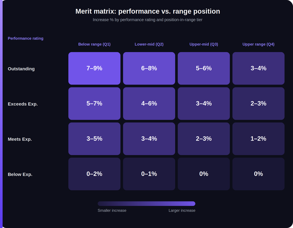
Notice the pattern reading across any row: increases shrink as range position rises, even though performance stays constant. Reading down any column: increases grow as performance rises, even though range position stays constant. Both dimensions matter simultaneously — that’s the entire point of the grid.
Step 4: Model the matrix against your actual population
Before finalizing percentages, run your actual employee population’s ratings and compa-ratios through the draft matrix and calculate the total resulting spend. If your modeled spend comes in over or under your target budget, adjust the percentages (not the population) until the matrix produces a total spend that fits your allocated budget. This modeling step is where most first-draft matrices get revised — the directionally correct grid rarely lands on-budget on the first pass.
Step 5: Set guardrails and manager guidance
Decide whether the percentages in each cell are fixed values or ranges managers can adjust within (as in the example table above). Ranges give managers flexibility to account for factors the matrix can’t capture — a critical skill shortage, a flight risk, a recent lateral move — but they also introduce variability that can undermine the matrix’s consistency goal if left too wide. Many organizations start with fixed midpoints and only widen to ranges once managers have a cycle or two of practice with the tool.
Step 6: Communicate the logic, not just the number
The matrix should be explainable to managers, even if the underlying grid isn’t shared verbatim with every employee. Managers should be able to say, in plain terms, why two employees with the same rating received different increases — because compensation decisions that can’t be explained tend to erode trust in the process, regardless of how mathematically sound the underlying logic is.
Common Pitfalls to Avoid
Treating the matrix as fully automatic. A merit matrix is a strong default, not an unbreakable rule. Build in an exception process for cases the grid genuinely can’t account for — flight risk, a recent promotion, a market-rate shift specific to one role — rather than forcing every decision through the grid with no override path.
Ignoring rating distribution skew. If most of your organization clusters in “Meets Expectations,” and your rating process doesn’t meaningfully differentiate performance, the matrix’s performance axis won’t do much work. A merit matrix’s effectiveness depends partly on having a performance review process that actually distinguishes performance levels.
Forgetting to revisit range boundaries annually. A merit matrix built on stale salary ranges compounds the same problem the matrix is meant to solve. If your bands haven’t been refreshed against current market data, your compa-ratio calculations — and therefore your merit decisions — are working from an inaccurate picture of where employees actually stand.
Applying one matrix across dramatically different job families without adjustment. A single grid might work fine for a company with relatively homogenous roles, but sales, engineering, and corporate functions often warrant separate matrices (or at least separate budget pools) if their market pay dynamics diverge significantly.
Why This Matters Beyond the Spreadsheet
A well-built merit matrix does more than distribute a budget — it’s one of the clearest structural defenses against pay compression, one of the most transparent ways to justify pay decisions during an audit, and one of the few tools that lets a comp team say with confidence that similarly-situated employees are being treated consistently.
Building and maintaining one by hand in a spreadsheet works, but it gets fragile fast: modeling total spend against a live population, tracking compa-ratios that shift every time someone gets a raise, and re-running the numbers every cycle is exactly the kind of repetitive, error-prone work that a compensation platform built to model merit scenarios, calculate compa-ratios automatically, and simulate budget impact in real time is designed to take off a comp team’s plate.